MEB
Website Revamp
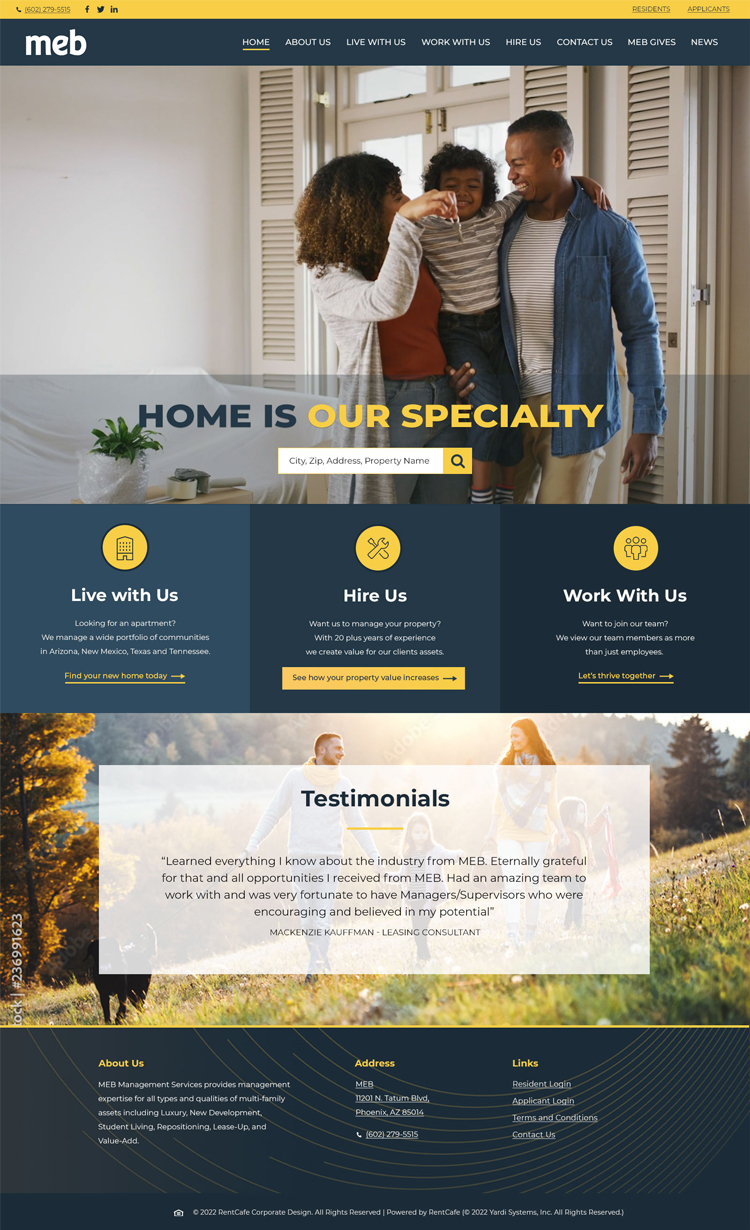
MEB wanted to keep their homepage short and sweet giving their users a glance into how great of a company they are and guiding them to the 3 most prominent pages on their site.

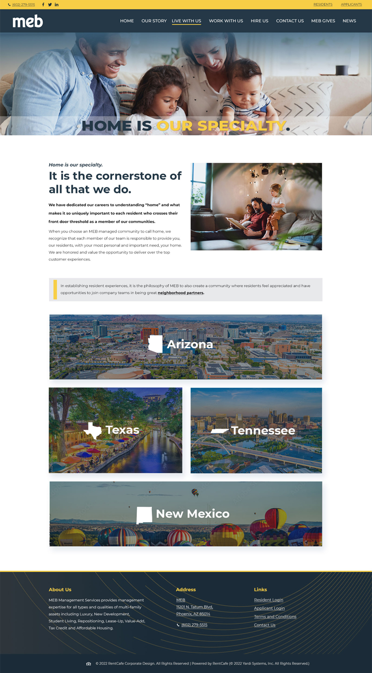
I really wanted to convey a feeling of "yes, we get you and are here for you" on the "Live With Us" page. Italicized words, an image of a father with his kids and images to show special events/places within the states where they have properties helped to convey this feeling.

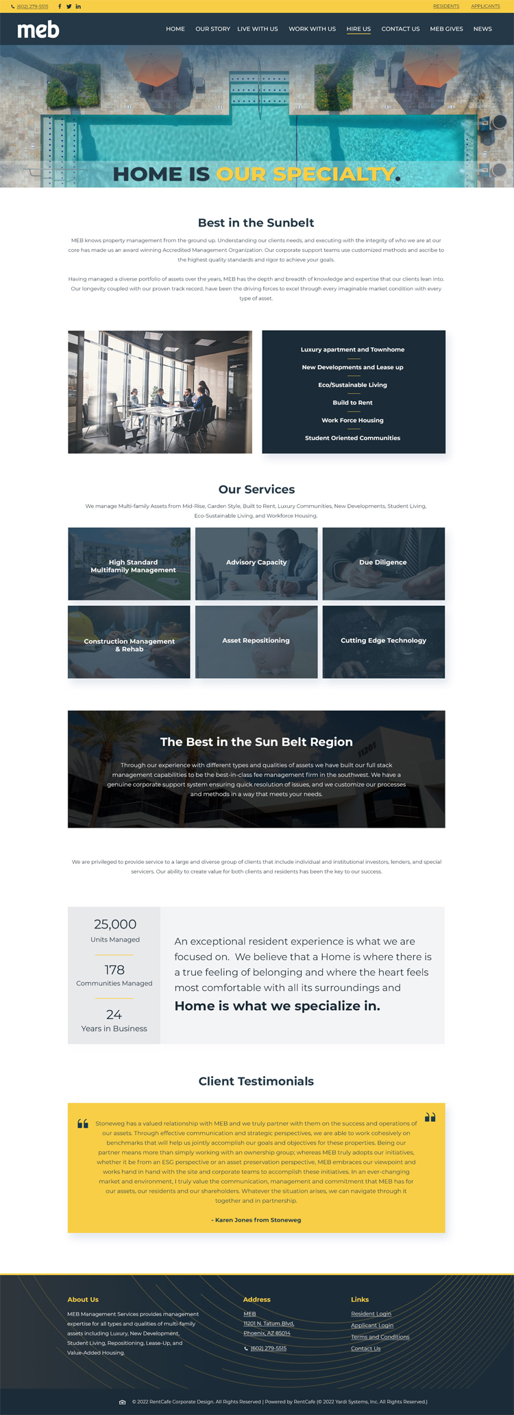
The "Hire Us" page is for companies who needed property management services. It was important to highlight past clients, MEB's property management stats, and what services they specialized. Breaking this infomation up into sections really helped to develop a nice flow to this page.

